High Quality Organics
CLIENT: HIGH QUALITY ORGANICS
LOCATION: RENO,NV
DELIVERABLES: REDESIGN LOGO | BRANDING | PACKAGING | WEBSITE | SOCIAL MEDIA | AMAZON A+

Old Logo

New Logo
Redesigning The Logo
We worked through various iterations of the logo. The original logo was an iteration of the parent company’s logo “HQO” where the express emphasized speed and ease. However, I thought it was important to emphasize the word “organics” as the most important and legible word for the logo. I bought the logo back to it’s original intention as well as keeping it modern. We played around with the leaf at the top of the new logo but the company decided to keep the old “HQO” element at the top in order to keep old brand recognition.
*You may see elements of the logo redesign after a few years the HQO badge was dropped and a leaf logo was created in its place
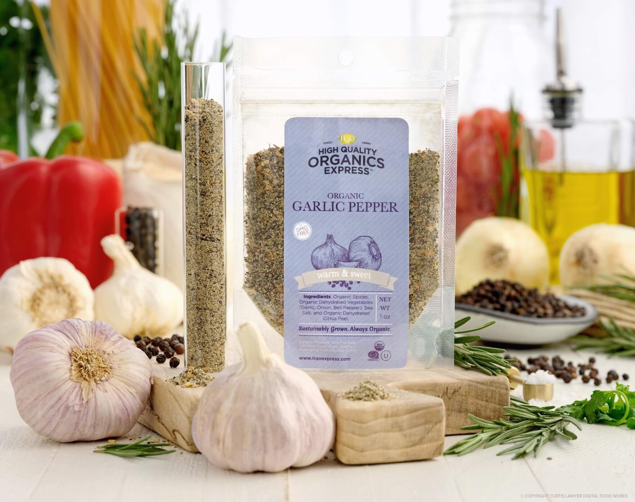
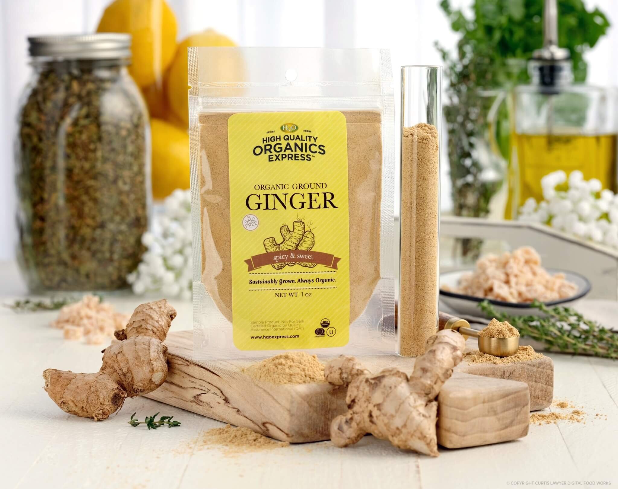
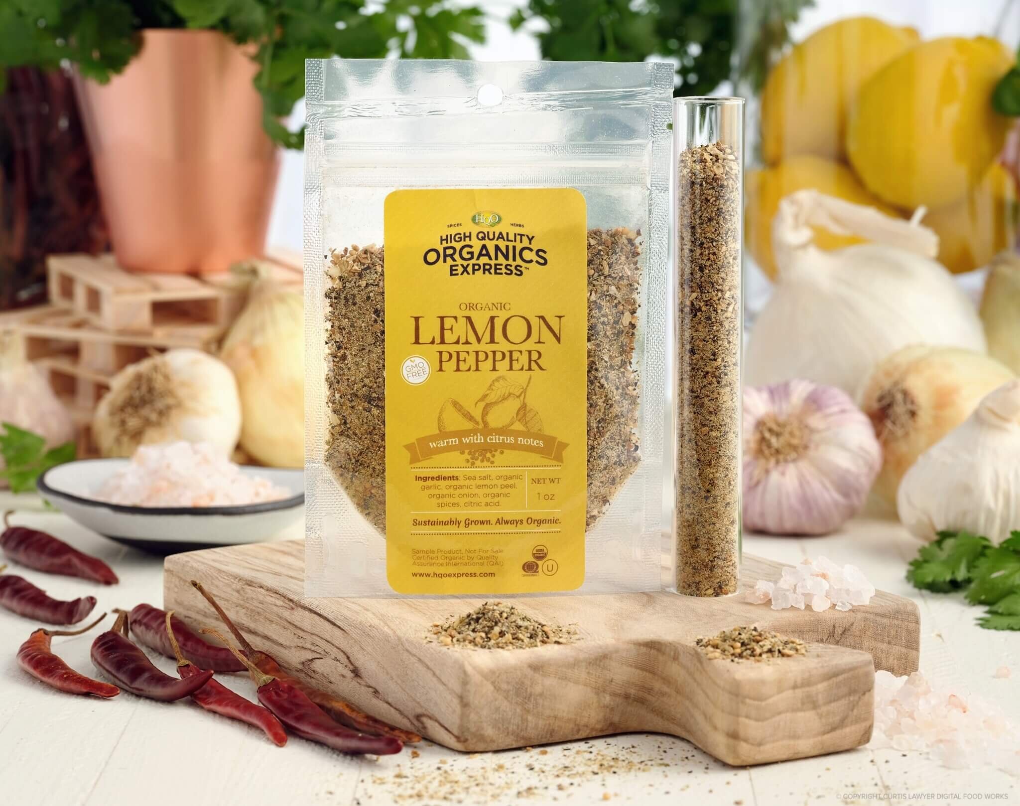
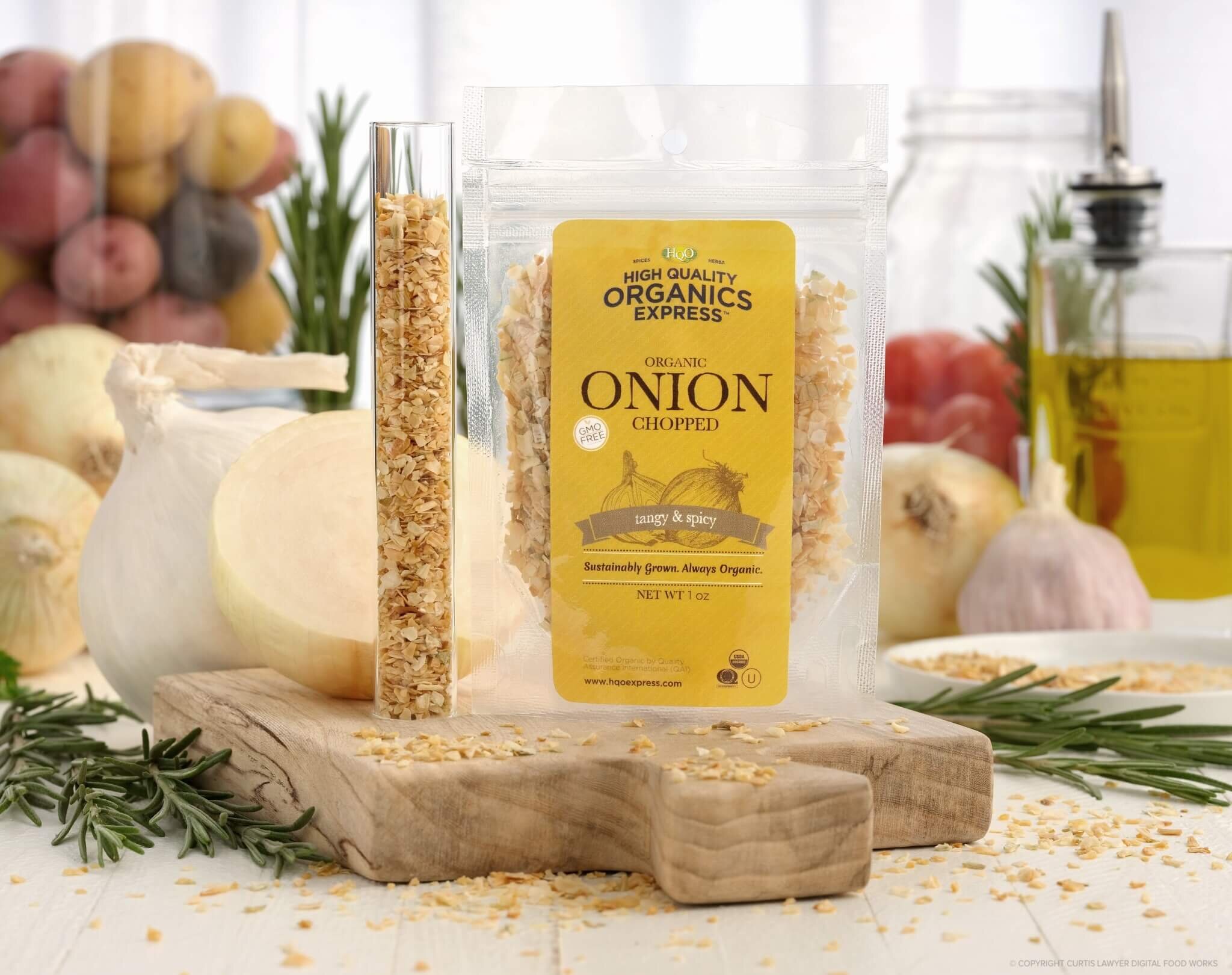
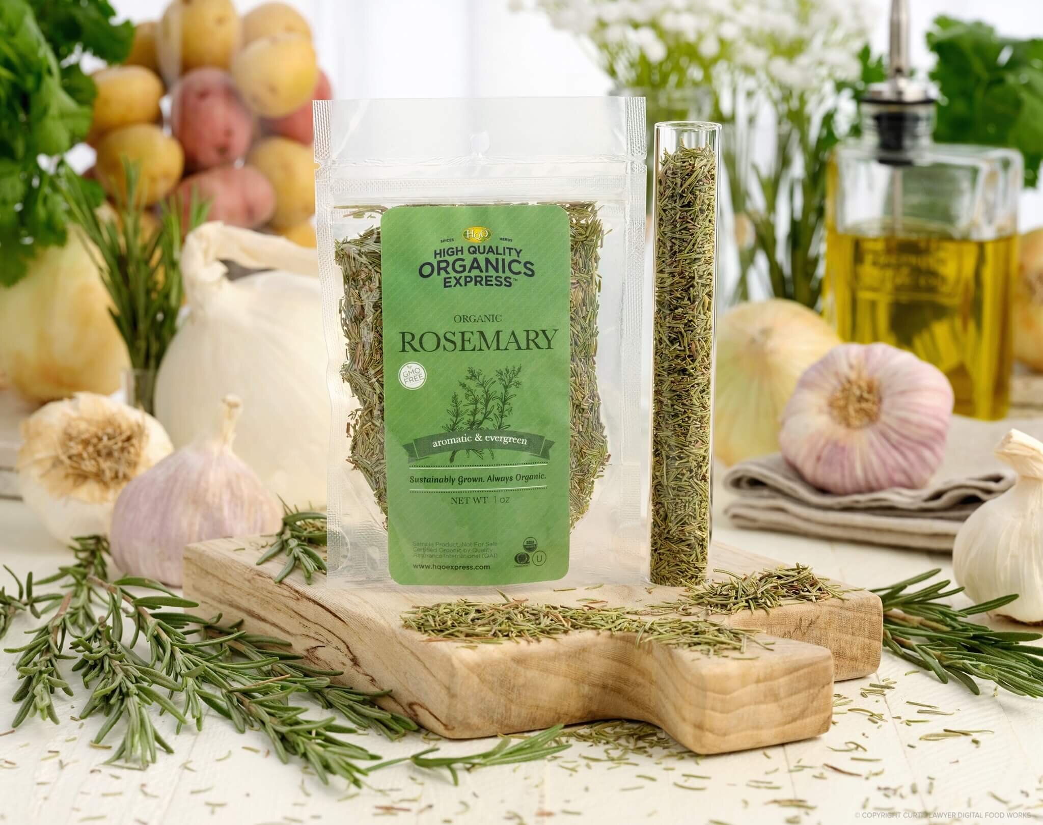
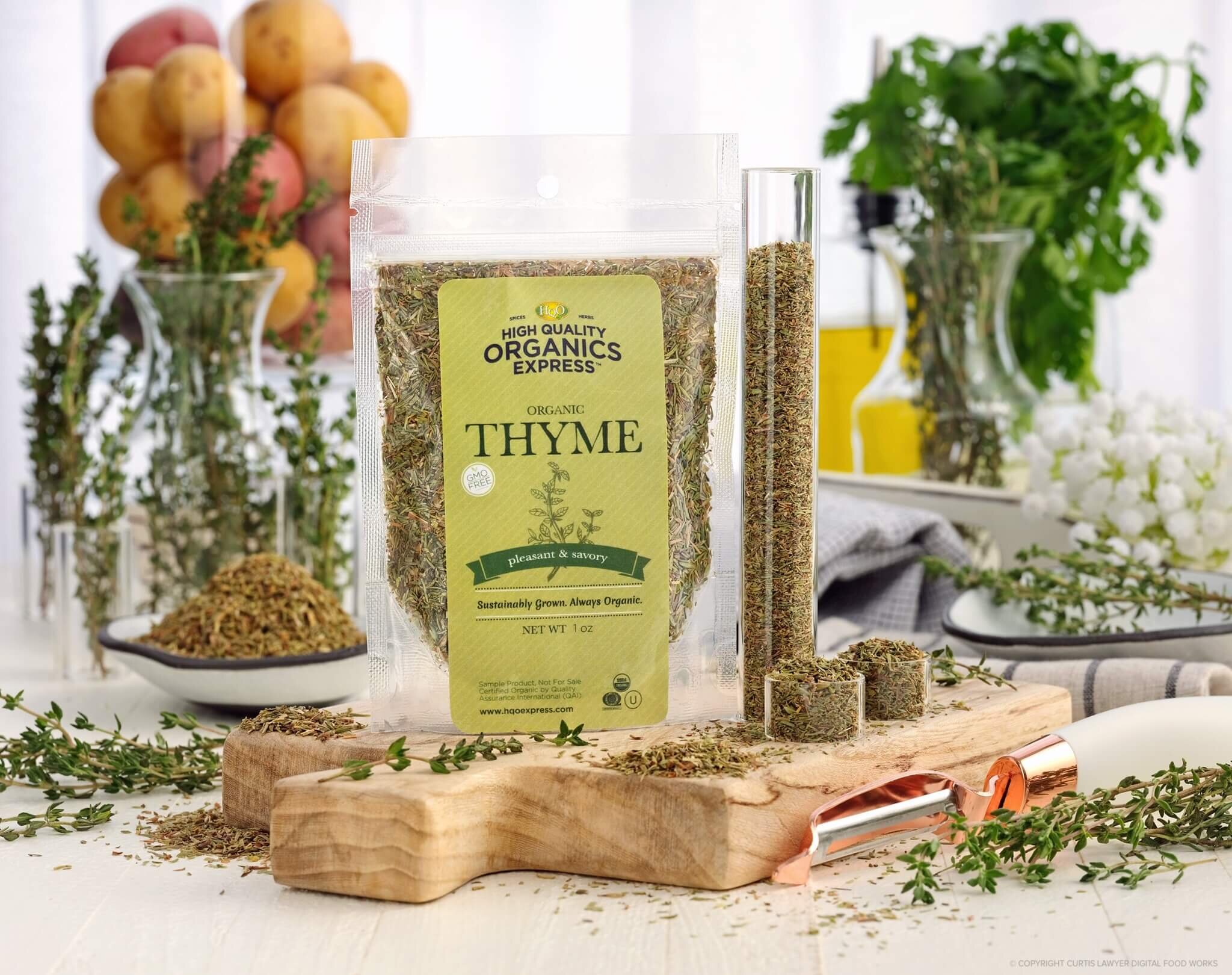
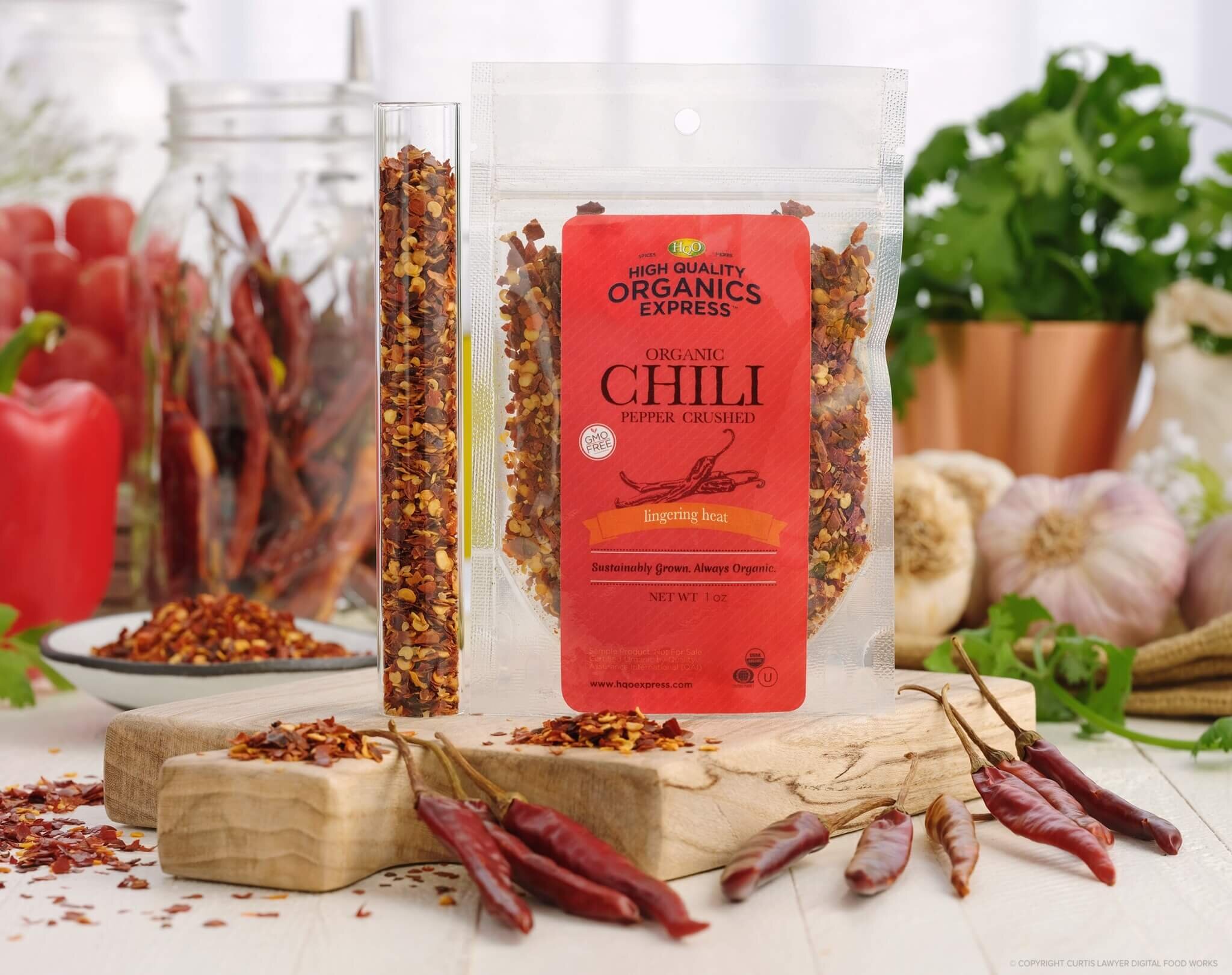
My first job was to modernize the 1 oz sample bags and replace it with the new logo. I came up with design that reflected the company’s beginnings when it was started in 1977. The design was “modern-vintage”. Current day, there is a negative connotation with convenience in the world of natural foods. I brought out details that would speak “natural” and “back-to-your-roots” with hand drawn herb and spice illustrations. Check out some of the photography before by Digital Food Works. Designs for the bags were done for 50+ products.

Old Sample Pack Design

I put together this marketing piece to reach out to influencers, restaurants, and chefs.
15 page cookbook
Thank you card with discount code
10+ spice bag labels
Stickers
= All inside a burlap bag
BEFORE & AFTER
The company started the express line as an extension of their wholesale business — thus continuing to use their wholesale labels. I created a new brand style that would replace their white labels with a green border. Together I worked with the team to get the bottle reshot at a 3/4 angle so the customer can see it’s a chef sized jar instead of a small household size jar. With the addition of shooting the new product with fresh produce in the front - the scale and the contents become more clear at a quick glance which is perfect for e-commerce.


AMAZON A+ PAGE CONTENT

The HQO team and I first published the products on Amazon and I came up with the layout for the A+ page content. Near the buy box we had some aspirational cooking images and product shots but as you scroll down you can read more information such as the origin of the spice and how it’s harvested. There is more content discussing the company’s history and values to gain the customer’s trust and help educate about the company they are buying from. Last I put a comparison box showcasing the product in other sizes and links to other products the buyer might be interested in that we sell.


I also moved the company to a Shopify site where I worked with a photographer to create new product images and lifestyle images that were non-existent before. Product photography is by 63 Moons Photography.
*This website was launched before the label redesign